Here’s the crux of the problem: When something is easy, people will do more of it.
When you produce your whole site by hand, from HEAD to /BODY, you begin in a world of infinite possibility. You can tailor your content exactly how you like it, and organize it in any way you please. Every design decision you make represents roughly equal work because, heck, you’ve gotta do it by hand either way. Whether it’s reverse chronological entries or a tidy table of contents. You might as well do what you want.
But once you are given a tool that operates effortlessly — but only in a certain way — every choice that deviates from the standard represents a major cost.
That’s what happened as Movable Type ate the blogosphere.
Homepage production became suddenly a question of economics:
- Go with the system’s default format: zero work.
- Customizing the system to your format: way more work than pure HTML ever was
And who, once offered a path of least resistance, has the energy to fight it all the way?
The format won.
It was easier — faster! — to literally go with the flow… of time.
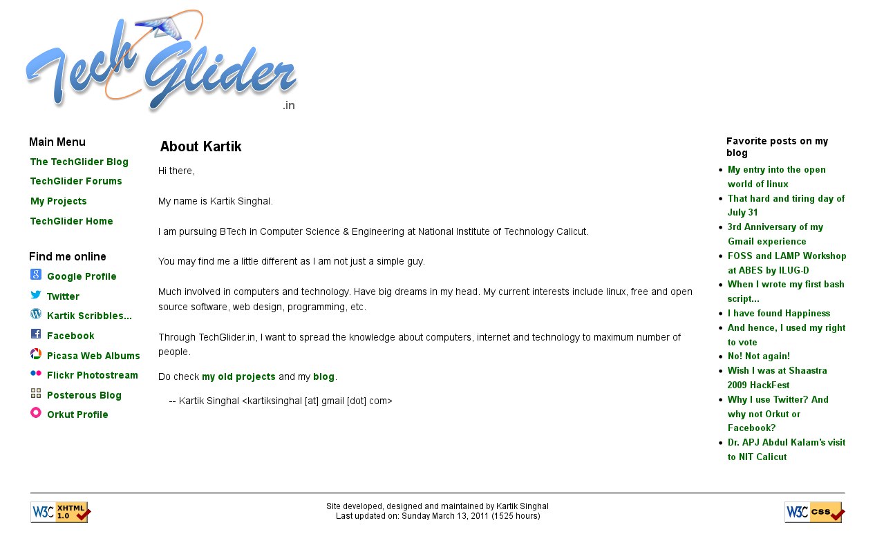
This reminded me how I hand coded my homepage back in the day. I was trying to look for screenshots to post here, but ended up looking at the Wayback Machine instead and to my surprise as many as 7 captures! See some: 1, 2, 4, 5. I had never looked up the Archive for my own website!
Here’s a screenshot from the time after I had switched from .com to a .in domain:
Further, I have been thinking and posting about how social media killed the Internet, but I was astonished to see how that thinking can be applied to blogging as well as this article argues, quite intriguing! Had I just fallen into the trap of the classic Luddite argument of opposing new technology?
Update (Aug 15, 2018): I found a better explanation of the problem here: The Garden and the Stream: A Technopastoral.
